
A high-converting page is not the page with the most forms
A high-converting cash-pay clinic service page helps the right prospective patient understand an accurate offer and take an appropriate next step. It should also help an unsuitable visitor self-select out. More raw form submissions are not useful if they become repeated fee objections, clinically unsuitable enquiries or appointments that never happen.
Build a clear decision path from the visitor’s search to a booked and attended consultation. The page must work for people arriving through organic search, referrals, site navigation and paid search. Each audience may know a different amount, but all need the same reliable facts.
The practical test: after one careful read, can a prospective patient explain what the service is, who provides it, what the first appointment involves, what they may pay and exactly what happens after they click?
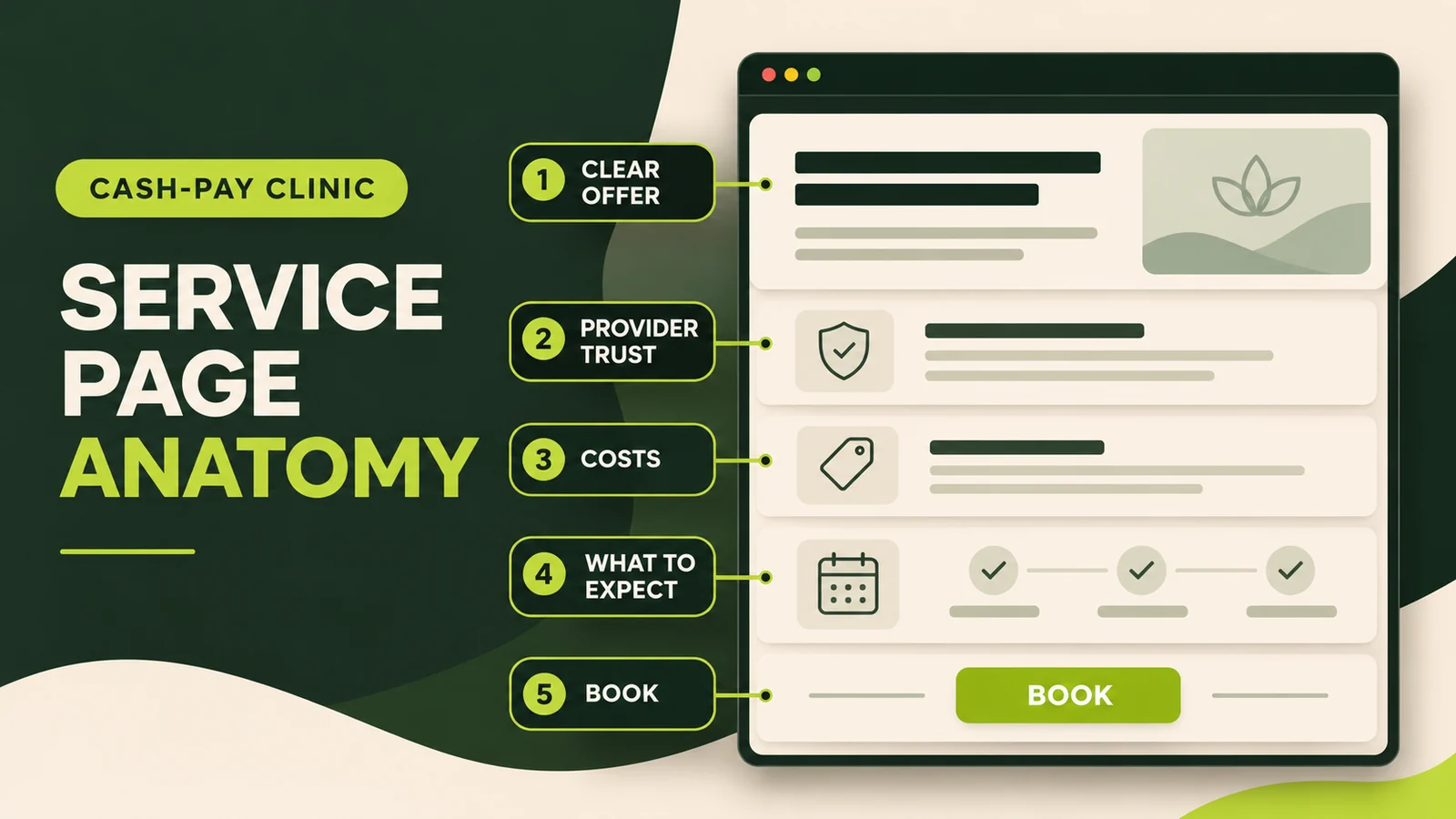
The complete service-page architecture
| Page section | Patient question | What to include |
|---|---|---|
| Decision block | Am I in the right place? | Specific service, patient group, provider or clinic, location, payment model and primary action |
| Fit and scope | Could this be relevant to me? | Common reasons people seek the service, eligibility limits and what it does not replace |
| First visit | What will happen? | Length, format, preparation, evaluation and realistic next step |
| Provider trust | Who will I see? | Name, role, relevant credentials, licensure and care approach |
| Cost and payment | What will I pay? | Verified fee, inclusions, exclusions, insurance or reimbursement position and estimate route |
| Objection handling | What am I still unsure about? | Concise FAQs based on real intake questions |
| Booking path | What do I do now? | One primary action, minimum necessary fields and a clear confirmation |
This is not a rigid design template. Change the order when the service requires it, but make every section answer a real question without hiding essential information behind vague sales language.
1. Make the above-the-fold decision block specific
The first screen should confirm that the page matches the search. Use a plain-language heading that names the appointment or program, not a slogan such as “Transform your health.” Add a short line explaining who the service is designed to help and where it is available.
A useful decision block contains:
- the exact service name;
- the clinic location or approved telehealth area;
- the provider or provider type;
- a factual description of the service’s purpose;
- a visible cash-pay price or a direct link to cost information; and
- one primary action such as Book an initial consultation or Request an appointment.
Avoid stacking several equal buttons for calling, booking, downloading, chatting and subscribing. Secondary contact options can remain available, but the visual hierarchy should make the intended next step obvious.
2. Explain fit without diagnosing through the webpage
Prospective patients need to recognize why someone might seek the service. Describe relevant situations and goals in careful, non-diagnostic language. For example, explain that patients may seek a consultation to discuss persistent concerns, previous results or a broader care plan. Do not imply that visiting the page confirms a condition or guarantees an outcome.
Fit information should include meaningful boundaries. State age limits, referral requirements, geographic restrictions, services not offered and circumstances that require urgent or emergency care. For a program, identify whether an initial consultation is required before enrollment. Clear exclusions may reduce the form count while improving the suitability of the bookings that remain.
Write for patients, not an internal clinical committee. Define necessary technical terms immediately and use headings that mirror questions asked on intake calls.
3. Show what the first appointment actually involves
Uncertainty creates friction. Replace a generic “personalized care” paragraph with a concrete first-visit explanation: duration, in-person or virtual format, records to bring, what the provider reviews and what happens afterward. Separate what is routinely included from what may be recommended later.
Do not turn the process section into a promise that every patient receives the same testing or treatment. A responsible sequence is: request or book, complete intake, attend evaluation, then receive recommendations when clinically appropriate. If suitability is reviewed before confirmation, say who reviews it and when the patient should expect a response.
This is also where operational accuracy matters. Check the description with the person who manages scheduling and the provider delivering the service. A beautifully written page fails when reception gives different appointment lengths, prices or preparation instructions.
4. Use provider-specific trust, not decorative badges
Cash-pay patients are evaluating both the service and the person delivering it. Include the provider’s name, professional role, relevant qualifications, licensing jurisdiction where appropriate and a short explanation of their approach. Link to a complete biography rather than reproducing a long résumé.
Trust elements should be verifiable. Real clinic and provider photography is more informative than unrelated stock imagery. Accreditations should name the issuing organization. Reviews must reflect genuine experiences and be used with the required permission and disclosures. The US Federal Trade Commission warns that a testimonial describing exceptional results can imply that others should expect the same outcome; a small “results may vary” line does not automatically correct that impression.
Keep clinical evidence proportionate to the page. Cite high-quality sources for material health claims, but do not use a reference list to make a service appear proven beyond the evidence. The goal is informed confidence, not borrowed authority.
5. Make cost and payment information usable
Cash-pay visitors reasonably want to understand the financial commitment before sharing personal details. If the initial visit has a stable fee, show the verified amount near the booking decision and explain what it includes. If cost varies, identify the factors that change it and provide a clear way to request an estimate.
State whether the clinic bills insurance, provides a superbill, accepts HSA or FSA funds where applicable, and charges separately for labs, supplements, procedures or follow-ups. Avoid presenting reimbursement as guaranteed. Our detailed guide to showing prices on a cash-pay clinic website covers pricing formats and page placement.
For US providers, the service page is not a substitute for required notices or estimates. CMS says uninsured or self-pay patients generally must receive a good faith estimate when they request one or schedule eligible care at least three business days in advance. Confirm the rule and any state or professional requirements with qualified counsel.
6. Build a short, privacy-aware booking path
Ask only for information needed to route or schedule the next step. Long symptom histories, detailed medical information and marketing questions create friction and increase the sensitivity of the data collected. If the clinic uses an external scheduling system, tell visitors where the button leads and make the transition visually coherent.
The confirmation matters as much as the form. State whether the appointment is confirmed or requested, when the clinic will respond, which channel it will use and what the patient should do if the need is urgent. Test the path on a phone, including validation errors, calendar availability and confirmation messages.
Tracking deserves special care. HHS notes that appointment information and an IP address transmitted to a third-party tracking vendor may raise HIPAA obligations for regulated entities. Do not place advertising pixels or session-recording tools on booking and intake flows by default. Map what each technology collects, where it sends data, and whether the necessary agreements and controls exist.
7. Support search visibility without weakening the page
Use one indexable URL for each meaningfully distinct service and location combination that has genuinely distinct content. Put the language patients use in the title, main heading, introduction, descriptive link text and image alt text where it fits naturally. Link the page from the relevant service hub, provider profile and useful educational articles.
Google recommends helpful, reliable, people-first content and descriptive titles rather than content created mainly to manipulate rankings. A service page should therefore demonstrate real clinic information: the actual appointment, provider, process, fee, location and next step. Rewriting the same generic copy for dozens of conditions does not create a useful service library.
On mobile, keep the heading readable, place the primary action within an early natural stopping point, and prevent sticky elements from covering content. Compress images, preserve their dimensions to limit layout movement, label form fields and maintain sufficient contrast. A fast page cannot compensate for missing information, but a slow or unstable page can obstruct an otherwise good decision path.
Service page or campaign landing page?
A service page normally lives in the site navigation, earns internal links and answers a broad set of patient questions. A paid-search landing page may simplify navigation and focus on one query, location or campaign. That does not justify thinner or less accurate information.
A strong service page can serve as an advertising destination when the query, ad and page offer match closely. Create a separate landing page when the campaign needs a materially different audience, location, appointment type or measurement path. Do not create a duplicate merely to change the headline while leaving the same content and offer underneath.
Measure the patient journey, not just the button
Record at least five stages: meaningful enquiry, suitable enquiry, booked consultation, attended consultation and acquired patient. Break these down by service-page entry, source and campaign when consent and privacy controls permit. Call clicks and form completions are useful diagnostics, but they are not final business outcomes.
Review qualitative evidence too. Which questions are repeatedly asked after patients read the page? Where do callers misunderstand cost or scope? Which appointments are unsuitable? These patterns reveal missing content more reliably than copying another clinic’s layout.
When the page changes, annotate the date and compare downstream outcomes over a sensible period. Do not declare a win from a small rise in clicks if bookings, attendance or patient suitability deteriorate. Our guide to measuring cost per booked consultation shows how to connect marketing activity with the appointment book.
A final pre-publish audit
- Confirm that the service name, provider, location, availability and fee are current.
- Read every health and outcome statement as a potential advertising claim.
- Complete the booking path on both mobile and desktop.
- Verify the confirmation, response time and staff handoff.
- Review forms, pixels, recordings and analytics for privacy risk.
- Check title, heading, canonical URL, metadata, image text and internal links.
- Ask reception and the provider to confirm that the page matches real delivery.
- Define how suitable bookings and attendance will be measured before launch.
Frequently asked questions
What should a cash-pay clinic service page include?
Include a clear service and audience, relevant provider credentials, the first-visit process, verified costs or payment information, location and eligibility details, FAQs and one obvious booking action.
Should a clinic show prices on the service page?
Show a verified fee when the service has a stable price. If it varies, explain why and how the patient can obtain an estimate. Review requirements that apply to the clinic’s jurisdiction and payment model.
Is a service page the same as a Google Ads landing page?
Not necessarily. The service page supports search, referrals and site navigation; a campaign page may reduce distractions for one traffic source. Both must match intent and describe the same accurate offer.
How should a clinic measure service-page conversion?
Follow meaningful calls and forms through suitability, booking and attendance. A form submission alone does not show whether the page generated an appropriate patient.
Turn the service page into a reliable decision path
The strongest clinic service page is specific where patients need facts and cautious where medicine requires judgment. It connects a clear offer with a credible provider, transparent process, understandable cost and tested booking route. That foundation supports organic visibility, referrals and paid acquisition without relying on inflated promises.
Wellness Practice Marketing can audit the full path from search intent to attended consultation, then turn the findings into a service-page brief your clinic can implement.