
The short answer
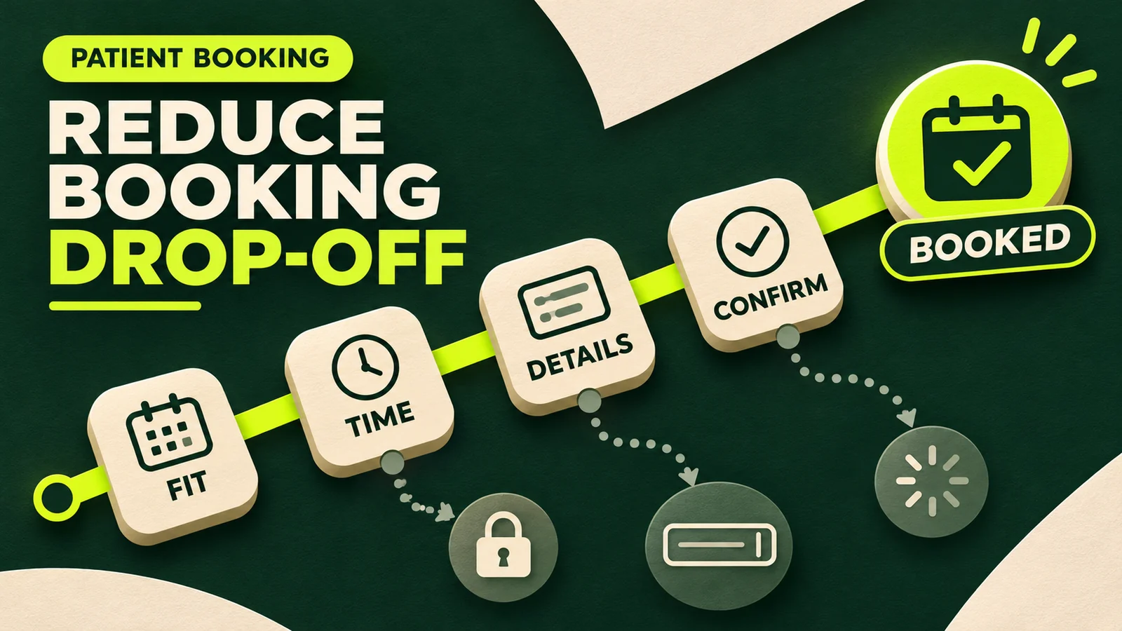
To reduce appointment booking form abandonment, first measure the journey from scheduler load to a verified confirmation. Then remove questions that are not required to reserve or safely route the appointment, show essential service details before the form, make availability and next steps clear, preserve information when errors occur, and test the entire path on a real phone.
Do not assume every exit is caused by a long form. A person may leave because the fee appeared late, no suitable time was available, the appointment name was unclear, account creation failed, the calendar was difficult to use, or the final screen did not confirm whether the booking succeeded. The fix depends on the point of exit.
Start with one rule: optimize for a correct, completed appointment—not the fewest possible clicks. A shorter path that routes people to the wrong service creates rework rather than a better patient experience.
1. Define appointment booking form abandonment correctly
A booking-button click is not a form start, and a form submission is not always a confirmed appointment. Establish a small event model that reflects the actual scheduler:
- Scheduler loaded: the booking interface rendered successfully.
- Booking started: the visitor made a meaningful first selection or entered the first required field.
- Critical step completed: service, provider, location, time or contact details were accepted.
- Booking confirmed: the scheduling system returned a success state with a valid appointment or request reference.
- Appointment attended: the confirmed appointment ultimately occurred.
Use the same definitions across reporting periods. There is no universal clinic benchmark that accounts for service complexity, traffic quality, appointment availability, new-patient rules and whether the flow confirms instantly or sends a request for review. Compare each clinic against its own baseline and investigate changes by step.
2. Find the exit before redesigning the form
Review the path by device, service, provider, location and traffic source. A mobile-only drop may indicate a layout, keyboard or calendar problem. A service-specific drop may mean the appointment type or fee is unclear. A sharp exit after the calendar may simply reflect poor availability.
Combine event data with direct observation. Ask staff members and a few representative users to complete a realistic task while explaining what they expect at each screen. Check the scheduler in an incognito browser, on cellular data, with keyboard navigation and at different text sizes. The 2024 mixed-methods study of online appointment booking in primary care found that practice-level organization, website ease of use, registration requirements and useful appointment availability all influenced awareness and use.[1]
Also read front-desk notes. Repeated calls such as “Which appointment do I choose?”, “Did it go through?” or “Why do I need an account?” identify gaps that a completion-rate chart cannot explain.
3. Resolve uncertainty before asking for contact details
The booking page should carry forward the decision already made on the service page. Before opening the scheduler, state the appointment name, who it is for, provider or provider-selection method, location or telehealth eligibility, duration, fee or deposit, cancellation terms and whether the result is an instant booking or a request awaiting review.
Use patient language instead of internal codes. NHS England usability guidance notes that people look for familiar words such as “appointment” and can struggle when actions are hidden behind supplier names or unclear labels.[2] “New patient consultation—60 minutes” is more useful than an unexplained abbreviation.
Keep the information consistent with the cash-pay clinic service page and the clinic’s pre-booking information. If the scheduler reveals a different price, provider or next step, hesitation is rational.
4. Ask only what the booking stage needs
Separate appointment reservation from clinical intake. The first process may need a name, reliable contact method, appointment selection and a small number of routing questions. A full health history, medication list, insurance upload, consent packet and detailed goals often belong in a secure intake workflow after the appointment is reserved or accepted.
Review every required field with three questions:
- Is this information necessary to reserve, correctly route or safely review this appointment?
- Does the clinic already have it, or can the selected service and provider prefill it?
- What exactly happens if the patient does not provide it now?
Remove duplicate fields and make optional fields visibly optional. Preserve completed values if someone goes back, changes the appointment time or receives an error. If an account is essential, explain why and let password recovery return the person to the same selected slot. Do not make patients repeat the provider, location or service they clicked from.
5. Show useful availability and prevent dead ends
A beautifully designed form cannot compensate for an empty calendar. Show the earliest relevant options, allow people to view another provider or location when appropriate, and explain what to do when no suitable slot is available. A waitlist, appointment-request route or staffed phone option is more useful than “No appointments found.”
Make routing questions understandable and limited to what the clinic can act on. If certain concerns require staff review, say that the request will be reviewed and state the expected response window. If the form is not suitable for urgent or emergency needs, provide an appropriate, jurisdiction-specific notice without trying to triage a medical emergency through marketing copy.
Online booking should be one supported access route, not the only route for every person. Research on primary-care booking found that some patients valued digital convenience while others needed or preferred telephone support, particularly when online services were unfamiliar.[1]
6. Make mobile completion and accessibility non-negotiable
Test the complete flow at the narrowest supported width, not only the clinic website page that launches the scheduler. Third-party calendars, pop-ups and payment screens can introduce horizontal scrolling, tiny controls, obscured buttons or keyboard problems after the handoff.
Fields and keyboards
Use persistent visible labels, suitable input types and autocomplete where appropriate. Do not rely on placeholder text as the only label.
Errors and progress
Identify the affected field in text, explain how to correct it and keep valid entries. Show progress only when it helps set expectations.
Calendar controls
Make available, selected and unavailable states distinct. Ensure dates and times can be reached and understood without a mouse.
Performance
Check loading, layout shifts and failure states on cellular data. Provide a clear alternative if the scheduler does not load.
W3C guidance recommends explicit labels for form controls and clear validation feedback that identifies errors and helps users correct them.[3][4] These are not cosmetic details; they determine whether people using screen readers, speech input, magnification, keyboards or different cognitive strategies can finish the task.
7. Measure the funnel without exposing patient information
Google Analytics can automatically collect form_start and form_submit events for detected forms, but the documentation also requires sites to prevent personally identifiable information from being collected.[5] Automatic submission events may not prove that a multi-step scheduler created an appointment. Where appropriate, validate completion against a privacy-reviewed success signal or clinic-owned booking record.
Do not send names, email addresses, free-text health concerns, appointment dates or sensitive service selections into ordinary analytics or advertising tools. HHS guidance explains that tracking technologies on appointment pages can transmit information that may be protected health information in some circumstances, and regulated entities must assess those data flows and applicable obligations.[6] The precise analysis depends on the clinic, data, vendors and jurisdiction; obtain qualified privacy or legal guidance.
A useful reporting model can often use non-sensitive operational events: scheduler loaded, step identifier, anonymous error category and verified success. Document each event, vendor, parameter, destination and retention rule before deployment.
8. Make success unmistakable and recovery respectful
The final screen should say whether the appointment is confirmed or merely requested. Show the service, provider, date, time, time zone, location, payment status and next action. Send the promised confirmation through the selected channel and provide a clear way to cancel, reschedule or ask an administrative question.
Do not treat every incomplete form as permission for marketing follow-up. If the clinic has a lawful, consented way to save progress or send a transactional reminder, explain it before collecting the contact detail and avoid including sensitive context in the message. Otherwise, improve the return path: preserve non-sensitive selections locally where appropriate, keep the booking link stable and make human support visible.
9. Test one hypothesis at a time
Choose the largest verified drop-off point and write a specific hypothesis. For example: “Showing the fee and appointment length before the scheduler will reduce exits at the service-selection step.” Change one material element, verify that the scheduler and tracking still work, and compare verified booking completion and booking quality—not just button clicks.
Protect against false wins. Removing an eligibility question may increase confirmations while creating more unsuitable appointments. Hiding the price may increase starts but produce more cancellations. Track rescheduling, invalid bookings, staff rework and attended consultations alongside completion.
A 30-minute clinic booking-form audit
| Checkpoint | Question | Evidence to collect |
|---|---|---|
| Entry | Does the button open the correct service, provider and location? | Test every major entry page on phone and desktop |
| Expectation | Are fee, duration, confirmation type and policies visible? | Compare service page, scheduler and confirmation |
| Effort | Is every required field necessary at booking? | Field owner and operational reason |
| Availability | Is there a useful alternative when no slot fits? | No-availability path and staff routing |
| Accessibility | Can the flow be completed with keyboard, zoom and visible labels? | Manual test and issue log |
| Success | Is confirmation unmistakable and accurate? | Success screen, email or text and booking record |
| Measurement | Can starts and verified completions be compared safely? | Event map, data-flow review and reporting definition |
Run the audit for one high-value service first. Correct broken handoffs and dead ends before testing copy or color changes. Then repeat for the services, providers and locations with genuinely different booking rules.
Frequently asked questions
What is appointment booking form abandonment?
It occurs when someone begins a defined scheduling process but does not reach a verified booking or request confirmation. Define the start and completion events before calculating the rate.
How many fields should a clinic booking form have?
There is no universal ideal number. Ask only for information required to route, reserve or safely review the appointment at that stage, then move detailed intake to the appropriate later workflow.
Should patients create an account before booking?
Require an account only when it is genuinely necessary. If it is required, explain why, simplify recovery and preserve appointment selections when the person signs in or resets a password.
How should a clinic measure booking form drop-off?
Measure scheduler loads, meaningful starts, important step completions and verified confirmations. Segment by device, service and source without sending sensitive patient information to analytics tools.
Fix the path, not only the form
Appointment booking form abandonment is usually a journey problem. The service page sets expectations, the booking tool exposes availability, the form collects information, and the confirmation proves whether the task succeeded. Improving one screen while leaving contradictory prices, empty calendars or broken handoffs in place will not solve the whole problem.
Wellness Practice Marketing can audit that path from traffic source to verified consultation and prioritize the changes most likely to reduce avoidable friction.
Authoritative sources
- Journal of Medical Internet Research: Patient use and experience of online appointment booking
- NHS England: Creating a highly usable and accessible GP website
- W3C WAI: Labeling form controls
- W3C WAI: Validating input
- Google Analytics: Enhanced measurement events
- HHS OCR: Use of online tracking technologies